Mobile App UI Design Rules Every Beginner Must be Aware of

Mobile App UI Design Rules for Beginners
Since the mobile app development is thriving as never before, the newbies in the design industry need to be aware of the essential mobile app UI design rules that are important for every designer. So, in this post, I am sharing a few mobile UI design rules that every beginner must be aware of in today’s date.
Size
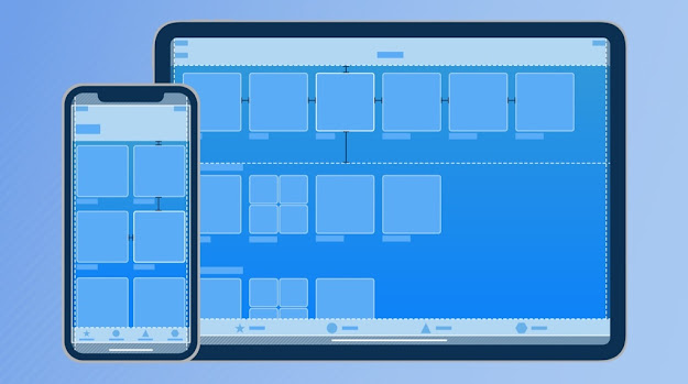
The size of mobile screens is the primary UI parameter that seems quite obvious to focus on. The size has a direct effect on visual design, ergonomics, and the entire user journey. Since the users aren’t using the mouse but fingers on the mobile device, designers need to emphasize this point and ensure a comfortable area for the users to browse through the mobile app.
Whitespace
The size of the mobile directly impacts the size of the components displayed and whitespace. The whitespace is a necessary part of a rich user journey since users do need a breathing space while they are browsing through your mobile app. You need to have large buttons that are clear to see and click in a hassle-free manner; otherwise, they might abandon your app and look for some other alternatives.
Interface Guidelines

Navigation
Users expect a hassle-free and simple journey throughout the mobile app; otherwise, they will abandon your mobile app and find some other mobile apps in the market. So, designers need to emphasize on ensuring excellent navigation so that customers can experience a hassle-free and straightforward journey for the users.
Readability
Focusing on all these points and keeping these rules in your mind will definitely help you in designing a great mobile app which is simply loved by the users and is appreciated in the entire market. More and more trends and mobile app design strategies will keep on evolving in the market; it will help designers improve their designing strategy and improve the user experience in the long run.


Nice blog!
ReplyDeleteThanks for sharing such an informative content on UI design rules. If someone is looking for the best app design companies then they can visit this link and explore the top companies.